
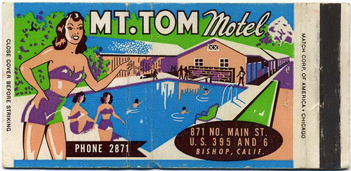
Whew! Check out the illustration on this tripped out matchbook cover! I love this and it fills my mind with all kinds of thoughts.
I would have loved to have been in the room when the person (perhaps Tom himself, the Tom of no other than "Mt.Tom") responsible for the final say on the art work for his motel met with the graphic artist responsible for this masterpiece...
TOM: "It's perfect! I love this look. You are a genius!"
ARTIST: "Well, Mr. Tom, I appreciate that. I really feel that this is some of my strongest work to date."
TOM: "I just can't get over how you took my color demands - Polythene Acid Green, Anti-Freeze Popsicle Blue, Three Mile Island Purple, and Sea Monkey Flesh Pink - and combined them into this treasure trove of beauty! Plus, what a doll you picked for the foreground!"
ARTIST: " Oh yes. You mean my rendering of Miss Promintine Hodgeswaller, winner of last year's Mt. Tom Glamour Gal trophy. When you told me that you wanted a dame who looked like she could break your heart one minute and then break a five pound amber-glass ashtray over your head the next, I knew just who to look for."
TOM: "Yes. Again, it's perfect. You'll go far in this business my young talented friend."
OK, so, I've let my imagination run wild once again. But it's a cold, Saturday morning in the middle of February, and, frankly, what else are matchbook covers like this for?
.jpg)
11 hours ago


1 comment:
Aww so good to hear from you.
YIKES Mike! First of all, I don't fully understand what Flicker is(thought it was like photobucket) and second, why are they being so mean over there? What the heck happened?
:-(
xx
Post a Comment